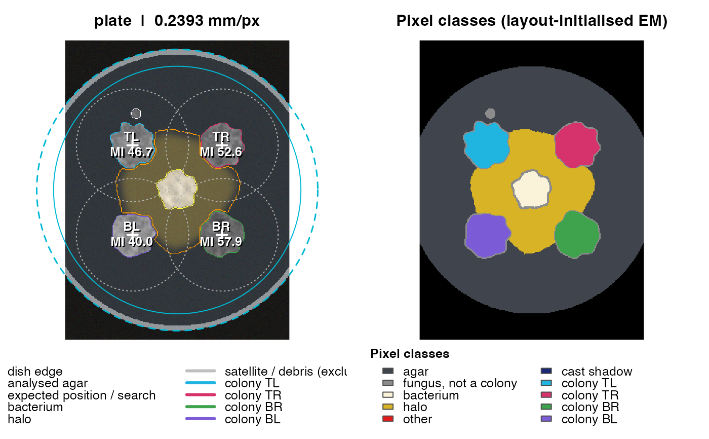
Always look at the QC figure before trusting numbers. The left panel shows the (flat-field corrected) photograph with the detected dish, the analysed agar disk, expected inoculation points and search radii, colony outlines, the bacterium and its halo; the right panel shows the pixel classification, with each separated colony filled in its own colour (same colours as the outlines on the left).
Arguments
Value
Invisibly x.
Examples
sim <- simulate_plate(width = 300, height = 400, seed = 11)
res <- analyze_plate(sim$image, verbose = FALSE)
plot_qc(res)